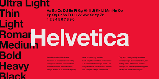
Rick Poynor: “Type is saying things to us all the time.Typefaces express a mood, an atmosphere. They give words a certain coloring.” Massimo Vignelli: “You can say, "I love you," in Helvetica. And you can say it with Helvetica Extra Light if you want to be really fancy. Or you can say it with the Extra Bold if it's really intensive and passionate, you know, and it might work.” Michael Bierut: “Everywhere you look you see typefaces. But there's one you probably see more than any other one, and that's Helvetica.You know, there it is, and it seems to come from nowhere.You know, it seems like air? It seems like gravity?” Jonathan Hoefler: “And it's hard to evaluate it. It's like being asked what you think about off-white paint. It's just... it's just there. And it's hard to get your head around, because it's that big.” Erik Spiekermann: “Most people who use Helvetica, use it because it's ubiquitous. It's like going to McDonald's instead of thinking about food. Because it's there, it's on every street corner, so let's eat crap because it's on the corner.” David Carson: “Don’t confuse legibility with communication. Just because something is legible doesn't mean it communicates and, more importantly, doesn't mean it communicates the right thing.” Assignment: Due EOC Dec. 7
On a google doc write a brief 250-500 word essay response to one of the quotes above. Do you agree or disagree with the statement and why. Give supporting evidence.
0 Comments
Leave a Reply. |
Mrs. BibleDigital Media & Art Educator Archives
May 2022
Categories
|
||||

 RSS Feed
